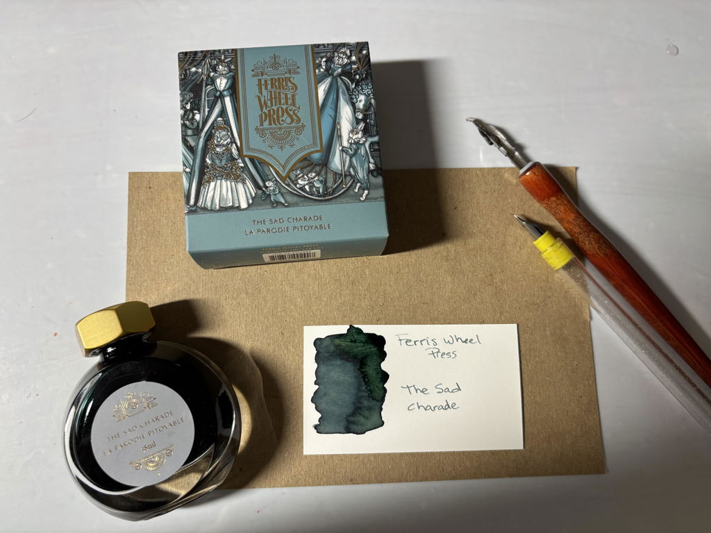
Skip to content

The Sad Charade

$32.00
Availability: Translation missing: en.general.icons.icon_check_circle icon Only 21 left!
Description

Join an elaborate parade filled with dazzling floats and mesmerising performers, jesters and acrobats sprinkle whimsy and wonder throughout the splendid spectacle. Draped in opulent carnival attire, immerse yourself in the pageantry, captivated by the enchanting revelry and the dazzling performances that fill the air. Allow this enchanting experience to kindle the spark of inspiration within you, beckoning you to infuse a touch of that very magic into your own tales with the exquisite depths of this grey-blue ink.
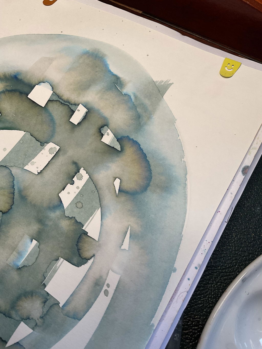
Ink Tone:Slate-grey
Characteristics: Delicate, moody, forlorn

Features

• 38ml ink reservoir
• Rich and saturated tones
• Water-based and compatible with all fountain pens
• Signature brass cap

Once Upon a Design

Notable design details:

  • A grand parade makes its way around the grounds of Lady Rose’s estate. A yearly celebration inspired by the different Carnivals of Europe.
  • Lady Rose, the illustrious hostess peers down from the second floor balcony alongside Lord Evergreen.
  • Performers don costumes inspired by Ferris Wheel Press; a carousel, the Ferris Wheel, and even a buoyant hot air balloon.

Customer Reviews

Based on 10 reviews
90%
(9)
10%
(1)
0%
(0)
0%
(0)
0%
(0)
V
V.J.
The Sad Charade - 38ml Fountain Pen Ink

Described as "Slate-Grey" this ink has a lovely cool light to dark green-teal undertone with shading ability that reminds me of forests, Christmas trees, and magic of winter. Reminder, user beware, the lovely FWP bottles could easily be a messy expensive nightmare if not careful. To avoid this I put the bottle in antique rectangular measuring cup, or square candle holder, and keep eye on wayward paws, as my environment real life far from risk free simple would like it to be. I invested in small glass bottles that use eyedropper to transfer ink to and use from, avoiding spills and contamination. I enjoy experimenting and drawing with FWP inks, dipping antique nibs, dip fountain pens, and brushes into and applying on ink wash, which can create subtle hue and shimmer. Although FWP inks have higher price point than some other wellknown quality inks, what better time to try than Final Batch discounted price, end of Year / New Year promotions. which at time of review inks still advertised buy 2 get 1 free, collect loyalty points, daily spin for more (sadly like website problematic, not working often although required 24hrs passed between spins), can stack with other promotions, offset the high minimum base plateau for free shipping with FWP, avoid the high shipping cost on smaller purchase which makes unrealistic - sadly can't just pickup since office address only community away. And if like, larger bottle better value if option. Luckily I invested in adding to collection before drastic price increase on many inks! Nice feature of many of FWP is the silicone round or stopper that keeps from leaking easily. Don't forget to put back in place first before put cap back! Packaged in fancy compact colourful rectangular box, that easy to store without lot of excess empty space like some FWP inks, weird size, or shape. Pleased FWP claims their inks at least are Made in Canada, hope that means all types and components sourced here. And that someday all their products and staff will be, making Canada strong, free and great again in all ways that important for wellbeing of nation, people, economy, future, sustainability, resilience, environmental impact, footprint, and returning Canada to lead producer of pens and inks once again.

C
C.
Beautiful shading

At first I’d thought this ink was a muted blue but when swatching it found it had green tones. Not mad about it but it was a pleasant surprise. It has a beautiful shading and once dry the ink is perfect!

B
Brent Ladouceur
Very Interesting Ink

This is such an interesting ink, the colour is hard to describe but not what I expected in person, I really enjoy it though, flows wonderfully in everything I've put it in and changes its character quite a bit depending on the paper. Won't be a daily use for me but absolutely excited to have it in the collection.

A
Andrew L.
Old Recipes Without the Wait

If you've ever looked through old handwritten recipes written in blue and loved how the colour has darkened and and became a bit less saturated over time, this ink gets extremely close to the same look, without needing to wait 50+ years. Paired with off-white index cards or paper stock, can give a very vintage feeling to the writing.

M
Melanie Poirier
Lovely

a beautiful moody and dreamy blue-grey. Reminds me of a rainy day !

A
Angela Lee
Beautiful

I love the mute tone of this green. One of my favourites so far

Comparison Table